This is the sixth installment in our From Lexington series that chronicles the journey of starting a climbing gym.
By Chris Shotwell
The very first thing we did when we set out to open a gym was to start recalling the natural features we had encountered outside that were both unique and lent themselves to fluid movement. We combed through guidebooks from all over the world, peppered the pages with sticky notes, and cruised the web for more information. The Facebook messenger thread we used to share design ideas is comically long; hundreds of links are all piled up for quick reference. Our goal was to create a space that communicated a number of different concepts in a very connected way.
The Layout
After we figured out the general feel and aesthetic we desired in our facility, we kicked off a competitive bidding process. We contacted several wall companies, to give us an estimate of the climbing space and layout. The initial response provided us with a starting point to discuss matters of taste, layout expectations, and overall flow of the facility. Some companies answered with full fledged design concepts, but Martin Sharkov, from Walltopia opened with a blank slate sketch.

As might be expected, the original design was a far cry from what we had envisioned and included an arch feature. An arch is often suggested to add wall surface and as a supportive structure for overhanging, large scale features. However, in our experience climbing arches have never left us with a positive impression. Routes often intersect, the lower-offs are typically in high traffic areas, and we find it can cause gyms to seem cramped. The arch was out of the question, whether in the roped climbing area or the bouldering area.
We instead proposed a U-shaped roped climbing zone with cleaner sight lines. We liked the concept of building a little eddy into the design for a kids’ sector, and had considered various ways to accomplish this already. We also needed more linear bouldering space since we wanted to mimic World Cup style features as well as many of the features we saw in various foreign gyms. We responded with a major layout update and moved forward into a Sketch Up model.

At this point, budget restrictions forced us to downsize our building from 30,000 square feet to roughly 25,000 square feet. To avoid giving up a substantial amount of wall surface, we reevaluated the layout and pushed for a steeper central lead feature; our desire for ever steeper terrain became a running joke throughout the design process.
The modified layout was a blessing in disguise. Our World Cup Wall received significantly improved viewing angles and hid many of the columns in the building. There is more room for spectators and mingling amongst sport climbers and boulderers. The corridor in the bouldering area is less than ideal, but it is the best way to combine maximum wall space while maintaining traffic flow.

Designing the Lead Wall
Satisfied with the general layout, we narrowed our focus to the individual elements. Our main concerns centered around our major bouldering features and our primary lead feature. Nicole had a clear vision of what the lead feature should be, which entailed a swelling wall that increased in steepness from left to right. We wanted it to resemble a crag straight out of France or the Red River Gorge.
To make such a swell possible we had to decide if we would be content with making the lead wall out of fiberglass. Although complex shapes can be formed with fiberglass, fiberglass also has its limitations including cost, the inability to use sizable volumes due to its complex, uneven surface, the tendency of big holds to spin and an added difficulty in set-screw use. What we really wanted was plywood and pushed hard for complex curvature with the material. Our lead designer was confident that we could pull off what we were looking for with their 2D Curves product. Before final approval, the engineers and production team would need to agree to this use.
Following a week or so of waiting, the engineers confirmed that such a swell could be constructed out of plywood. The important piece of information to remember when working with the Walltopia’s 2D curves system is that a flat panel must be employed to connect the adjoining structure. All along we had stressed our inclination for gradual transitions, but that wouldn’t be an option in this case. Our designers had mentioned either mirroring the swell or building the inverse of it on the right side. When they felt strongly about a feature, we tended to allow them to draw it up before we made a decision. It also gave us time to think about what we might choose instead. We wanted the climbing to be varied, and we also needed to make sure that using more curved plywood in this element didn’t push us over budget.

After more collaboration the main feature of the lead wall was complete so we began to toy with top rope walls around it. We worked hard to decipher the kinds of wall shapes and angles that would meld seamlessly with the huge swell, imparting a feel as if it was all one continuous crag. We absolutely loved climbing in the south of France at a little cliff called Buoux; an uninterrupted limestone cliff line comprised predominately of small bulges and rooflets. The nature of the climbing would blend well, but be less intimidating. Our design tenet has been ‘no boring walls,’ so we fought hard for awesome easy terrain.
We added an articulated wall that would vary greatly from the swell, it would be an excellent learning tool for less advanced climbers by teaching them to rest in the less overhanging terrain, and since it was geometric, giant volumes could be used. It also created a sharp arête that we have become quite attached to.
Boulders
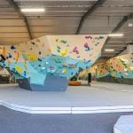
Our boulders had been left virtually untouched during all this back and forth about the roped climbing area. As we turned our attention to this area, each suggested bouldering feature was developed and placed in a sequence that would provide gentle transitions. We specified the World Cup features first and arranged them in typical World Cup format, where sharp angle changes are common between elements. This arrangement will let us host amazing onsight competitions, a crucial part of our mission.
We wanted the remainder of the bouldering space to be more organic and provide flow between faces. We drew up elements we had seen in places like Bishop and Rocktown. We included a small subset of features we thought were eye catching from other facilities.

Around the time the bouldering corridor was starting to take shape, we were informed that a 5′ egress was required between pads for Kentucky’s ADA compliance. We were forced to cut back on some of the steepest features and had to be very careful in their arrangement going forward. Although the timing was mildly inconvenient, we were relieved to catch it. The egress also improved traffic patterns and created a designated zone for bystanders.

A Professional Opinion
In spite of the progress we had made, we still felt that the bouldering area was a bit of a mess. Some of the bouldering walls were too busy; the concepts were blending together and not creating the well considered variety we were going for. Our technical space was cramped and poorly placed. Some of the problems could be solved easily, but we wanted to move in a direction that created more overall harmony in the bouldering space. Nicole and I discussed what we needed to do to move forward, and decided that it was time to have someone else take a look.
We had already established a relationship with professional route setter and international consultant Tonde Katiyo, so we brought him in to review the terrain. This got a new set of eyes on the project and gave us a review that was based on our program goals.
Tonde was mindful of our major objectives and the flavor of our design; he knew that we wanted terrain that allowed for superb climbing of all styles, to reward skill driven climbers, and to provide engaging climbs for people of all skill levels and body types. A quality of Tonde is that he rarely suggests a precise solution to a problem. He makes observations, asks questions, and allows you to take your own direction. He echoed our concerns about particular areas and left it up to us to resolve them in a way that would remain true to our vision.
As we chatted with Tonde, we jotted down ideas that came to mind and made note of concerns. Overall, the goal coming out of the review was the same as that going in. We would need to simplify the whole gym through the rearrangement and elimination of superfluous elements.
In the rope areas we were initially shy of dihedrals and arêtes, but Tonde helped us to toss our inhibitions and permit them in various sizes and shapes. The new terrain has a lot more character, is friendlier to an expansive group of climbers, and meshes better.
In the bouldering area, we cut out awkward faces and redundancies. We even chopped off the end of the peninsula boulder to improve traffic flow. Many of the features and transitions were totally redesigned now that each had a specific purpose. Tonde sent us a photo of a subtle arête from Japan and we started to look at other facilities and found some great concepts to work with.

Tonde’s European background was invaluable when it came to the World Cup portion of our bouldering terrain. We are steep junkies and made the mistake of incorporating an inordinate amount of extreme bouldering. We focused on supplementing all of the bouldering with technical terrain, especially the World Cup portion.
By reducing the sheer number of elements, we were able to treat the transitions as separate faces and give them a value of their own. Although we cut back on square footage, we optimized our terrain by regarding every single panel, even the transition panels, as viable wall space, not merely a means to connect faces.
Getting What We Wanted
We found the whole design process to be long, but enjoyable. Our desires were very specific; we weren’t willing to compromise on the quality of any of the features.
We’re aware that we took some big risks with the design of this facility, but we needed it to be a bit unusual to meet our program goals. We didn’t want to take the risk of opening a large climbing facility in Lexington without making it the gym we have always wanted to experience. It certainly has its own character, and we are incredibly proud of it.
From Lexington is a CBJ original series written by Chris Shotwell about the trials and tribulations of opening the L’Escalade Climbing in Lexington, Kentucky.


